How I Use Masking to Refine a Sunrise at Kerry Park, Seattle
Strategic masking can elevate a photo from so-so to amazing. Check out this post to learn how I typically use masking in my Lightroom Classic development workflow.
POST-PROCESSINGLIGHTROOM CLASSIC
Annette Stiers Jones
3/2/20263 min read
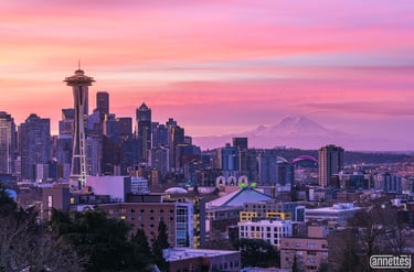
Sunrise over the Seattle skyline from Kerry Park is always compelling — especially when Mount Rainier reveals itself in the distance. But even in a strong image, light and attention can be refined.
In this tutorial, I’ll walk through how I use masking in Lightroom Classic to:
Reduce distractions
Guide the viewer’s eye
Add depth and separation
Enhance natural light without creating halos
The goal isn’t to dramatically change the scene. It’s to shape the light so the viewer experiences it the way I did.
Step 1: Reducing a Distracting Color with a Brush Mask
The first issue I noticed in this image was a yellow-toned building that pulled attention away from the skyline.
Using the Brush tool in the Masking panel, I painted directly over the yellow area. I prefer a generous amount of feathering to avoid hard edges.
Within the mask adjustments, I used Point Color:
Sampled the yellow tone with the eyedropper
Reduced saturation
Lowered luminance slightly
This softened the building’s presence without removing it entirely. Subtle control is usually more effective than dramatic correction.
Step 2: Targeting Bright Highlights with Intersect + Luminance Range
At the base of the Space Needle, there was a bright area that drew the eye downward unnecessarily.
I created a second brush mask over the area, then refined it by:
Mask → Intersect With → Luminance Range
Using the luminance eyedropper, I selected only the brightest tones and adjusted the range slider to avoid affecting the shadows.
Adjustments included:
Lowering Highlights
Lowering Whites
Adding slight magenta to counteract green
Cooling temperature slightly
This preserved detail while reducing visual pull.
Step 3: Enhancing Mount Rainier Without Creating Halos
Mount Rainier was visible but lacked definition.
Lightroom’s Select Landscape → Mountains tool works well in many cases. However, in this image, it created slight haloing and uneven edges when clarity and dehaze were applied.
Instead, I deleted that mask and used a Radial Gradient centered over the mountain.
With a soft feather, I added:
A touch of Clarity
Light Texture
Minimal Dehaze
This approach gave Rainier presence while maintaining smooth transitions.
When enhancing distant elements, restraint prevents unnatural edges.
Step 4: Rebalancing the Sky with a Linear Gradient
The upper left corner of the sky was noticeably brighter, pulling the viewer’s gaze out of the frame.
To correct this, I used a Linear Gradient angled across the upper portion of the image and slightly reduced exposure.
This balanced the sky’s luminosity while keeping the natural sunrise glow intact.
Step 5: Recovering Color in Bright Sky Areas
There was a bright white area near the sun that lacked color.
Using a narrow Radial Gradient, I:
Lowered Exposure
Reduced Highlights
This restored color and prevented that section from appearing blown out.
Step 6: Softening a Distracting Cloud
One darker cloud stood out more than it should have.
To harmonize it with the rest of the sky, I applied a radial gradient and:
Reduced Dehaze slightly
Added warmth and magenta
Increased saturation
Lowered highlights
Then I adjusted the overall mask amount slider to reduce the intensity of the effect.
The result blends naturally rather than calling attention to the edit.
Step 7: Adding a Subtle Glow Where the Sun Rises
To enhance the sunrise atmosphere, I added one final radial gradient on the left side of the sky.
This included:
Slight negative Dehaze
Added warmth
Added magenta
Increased saturation
Reduced highlights and whites
As with the previous adjustment, I reduced the mask’s overall strength using the Amount slider to maintain realism.
Before and After
Using the master eye icon in the Masking panel allows you to toggle all masks on and off.
Without masks, the image feels flatter and more uneven.
With masks applied, light feels intentional. The viewer’s eye moves through the skyline, rests on Mount Rainier, and stays within the frame.
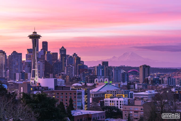

Before Masks
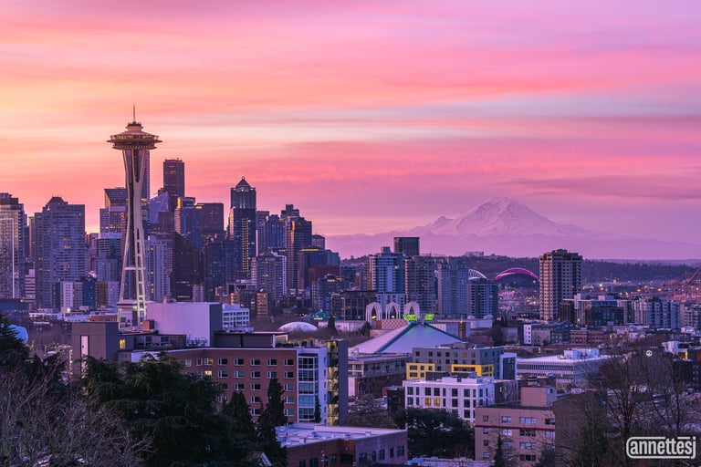
After Masks
A Practical Tip
If the floating mask panel feels intrusive, you can dock it into the right-side panel for a cleaner workspace.
Small workflow improvements can make complex edits feel smoother.
Final Thoughts
Masking is not about dramatic transformation. It’s about directing attention.
By selectively shaping light, color, and contrast, you can:
Reduce distractions
Add depth
Emphasize your subject
Maintain natural transitions
This Kerry Park sunrise already had strong light. Masking simply allowed me to guide how that light is experienced.
If you found this tutorial helpful, I’d love to hear your thoughts. Drop me an email. But please be kind; this is my first video tutorial! We all must start somewhere.
Thanks for reading, and happy shooting.
Contacts
annette@annettesjphoto.com
Socials
Copyright © 2023-2025 Annette Stiers Jones Photography. All rights reserved.