Printing Your Photos
If you'd like to make the leap from screen to print, check out this beginner's guide to get started!
PRINTS
Annette Stiers Jones
7/8/20249 min read

I have learned a LOT about printing the past few months. Most of this experience was gained through printing my images for various art exhibitions: Vancouver, Kent, and Edmonds, Washington, Art Fairs. I printed on a variety of media, including fine art papers and metal.
In this guide, I'll share what I've learned. This is definitely a beginner's guide and is geared towards someone just getting started. It is also geared primarily towards someone looking to use an external print house rather than your own printer. I've had great results using Bay Photo.
Minimize Your Variables
Printing can be tricky for a variety of reasons. There are a lot of variables between what you see on your screen and what you get back from a printer. Different screens have varying brightness, contrast, saturation, and tint. The lighting of the environment can effect how you perceive the image. The print medium may not be able to express the same colors that you see on your screen. Colors may come out less saturated and the shadows may be much darker than what you saw on your computer.
The more that we can control for all of these variables, the more sure we can be that what we see on the screen will match what we get off the printer.
Control Your Work Space
The lighting of your environment can have a big impact on how you perceive what is on your screen. It's best to keep things as consistent as possible and minimize variability. So what type of lighting should we have? I heard different recommendations from different sources; some to use only artificial light, others to use a blend of artificial and natural light. I think the best approach is to do what you can keep consistent. Natural lighting is going to vary based on the time of day (more golden or more blue depending on the angle of the sun) and the weather. I have a set room where I edit photos and close the blinds, and a lamp with lightbulbs of a specific kelvin, 5000 K. I use this set up every time I make final edits for printing. 5000 K is the industry standard, but you may choose to measure the temperature of the lighting in the place where you will display the print and then try to replicate that.
Glare on the monitor can also make it hard to edit your image accurately. There are some monitors out there that have built in hoods to prevent glare and also have a matte finish. I really like my monitor from BenQ. It has a matte finish and a hood included.
Calibrate Your Monitor!
This is an important step, and not as hard as you might think. To understand why this is important: think about a time you went to a sports bar, and saw the same game on different TV screens at the same time. This one over here looks way different than that one over there! One is more saturated, the other is more of a blue tone. Now imagine trying to edit photos like this! That's essentially what you're dealing with if you don't calibrate your monitor.
Monitor calibrators are pretty easy to get and use. I use a Datacolor Spyder X Pro. It is a small device that comes with step by step software to calibrate your screen. There will be some instructions in a setup wizard before you get started, such as to let your monitor warm up for 30 minutes prior to calibration. Then you place the device on the screen, and start the calibration. It will then display different colors swatches on the screen sequentially and create a calibration for you. It will then show you a results screen to compare the original versus the new calibration, and convert your monitor to the new calibration.
I have heard different recommendations on how often to calibrate. It may depend on how often you print! Most sources said every 2 months, but you may want to do this more often if you print all the time.
Color Gamut: How big is your box of crayons?
Color gamut is one of the biggest reasons that printing can be tricky. Think of gamut as like a box of crayons. The more crayons you have, the more colors you can express in your image. In general, monitors and screens have a pretty wide gamut; it's like coloring with a box of 96 crayons. But, most print mediums are going to have a smaller gamut. So instead of creating that image with 96 crayons, now you have only 64 colors to try to represent that same image.
To further complicate things, there are defined color spaces that even your monitor may not be able to display all the colors within that box. sRGB is the current standard defined color space for the web. Adobe RGB is a wider gamut than sRGB; it was designed to encompass most of the colors achievable on CMYK color printers. Different monitors will have different gamuts; not all monitors are created equal. One thing to consider is, how much of a color space can my monitor reproduce? For example, my BenQ monitor can reproduce 100% of sRGB and 99% of Adobe RGB.
Every combination of paper and printer is going to have it's own unique color gamut, the set of colors that it can express. That color gamut is defined by something called an ICC profile. An ICC profile will show you, on your monitor, what colors that printer/paper combination can express, and how the medium will change your image. ICC profiles can be obtained from the paper manufacturer or from the print house. Bay Photo, for example, has an ICC profile for every type of fine art paper, metallic prints, cardstock. etc. These are downloadable for free from their website.
ICC profiles can be installed very easily on PC. After downloading, right click on the file and choose install. That's it! Mac's are more complicated, but there are many resources online to describe the process.
Once you have downloaded and installed your ICC profiles, you know how many crayons you are working with! You will be able to see what colors your print medium can reproduce.
Now you are ready to start soft proofing
Soft Proofing in Light Room Classic
Soft Proofing is what we do to prepare our image for printing. We start with our original image and view it with the ICC profile, so we get an idea how well the print medium can replicate the image. We then make adjustments to the image within the proof to correct for the print medium and ensure all colors are reproducible on the printer.
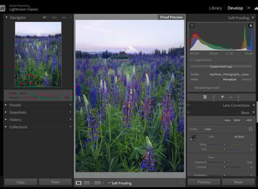
To begin, open your chosen image in the DEVELOP module of Lightroom Classic. We then check the box underneath the image, "Soft Proofing." If it is not there, go to the carat below the image, and make sure there is a check mark next to Soft Proofing. This will bring up the option Soft Proofing under the image so you can then turn it on.
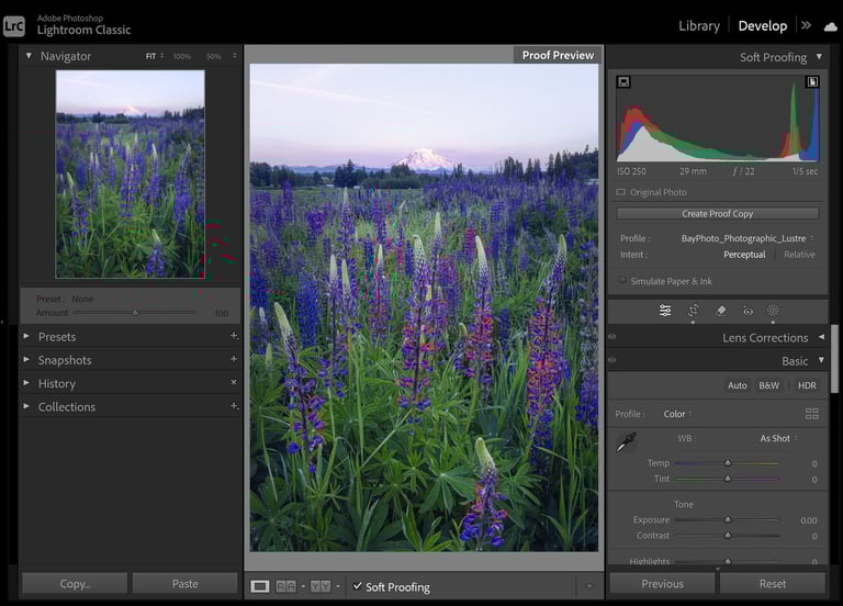
Next we select our ICC profile. This will be on the right panel, and will appear underneath the histogram once Soft Proofing has been turned on. From the Profile drop down select the ICC profile for your print medium. If it is not there, you may need to go to "Other", then choose the profile and click OK. If it is not in that list, make sure you have installed it, and restart Lightroom after it is installed.
Then we need to choose Intent. This helps Lightroom decide what to do if the print medium cannot reproduce your colors accurately (out of gamut). In perceptual, it will tend to keep the same hue but change the saturation. It compresses the image's gamut to fit within the media's gamut space, which can lighten or desaturate colors. In Relative, it will tend to keep the same saturation but adjust the hue. It preserves in-gamut colors and shifts out-of-gamut colors to the closest reproducible color. Bay Photo recommends Perceptual, so I chose this for my proofing.
All sources I have review do not recommend checking "Simulate Paper & Ink," so I always leave that unchecked.
Last, you will want to make sure you have Show Monitor and Destination Gamut Warnings turned on. These are the icons in the top corners of the histogram.
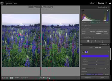
Now you should see some red or even blue highlighted areas on your image. If you don't, double check that you have the gamut warning and soft proofing turned on. You can drag the saturation slider all the way up to test it. Red will show what is out of gamut for the destination (printer/paper). Blue will show what is out of gamut for your screen. We can also turn on Before/After view (the Y/Y box below the image) to see the difference between the original image and the Soft Proof.
So we have out of gamut colors; what to do? This is where Light Room's Color Mixer/Point Color function comes in handy. Navigate to the Color Mixer module on the right side of screen. Click on the eye dropper tool, then navigate it to an area of the photo highlighted red. Click to sample the color. You can then change the color as you like to bring it into gamut.
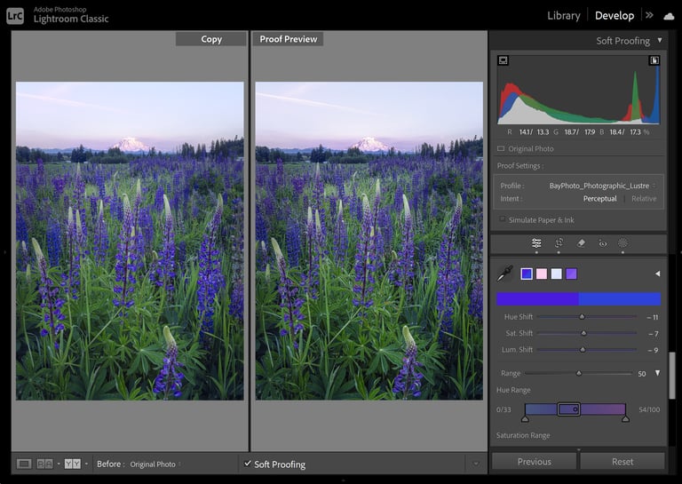
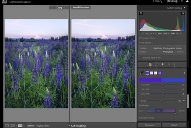
Experiment by adjusting the saturation, hue, and luminance shift sliders. You may try small change in all of these, if it helps. You can also try refining the range sliders that are below the shift sliders. This can help refine the range so you are effecting less of the image and just the areas out of gamut. You can also try sampling different areas that are close the the same color and adjustment them independently. This can all help make colors in gamut but preserve image quality. It can work better in this refined way, rather than one big adjustment to saturation.

Now that we've addressed the out of gamut colors, take a look at the proof compared to the original image. What differences do you see? This can be the hardest part, is really training the eye to see the differences. A common thing to look for is crushed blacks and shadows. Can you still see detail in the dark areas of the photo, or is it harder to see in the proof? You may want to bring up shadows and blacks using the sliders on the Basic panel. How do the colors look compared to the original? For example, I found that Metal Prints from Bay Photo tended to have more contrast and a more pronounced cyan tint in the proof. I corrected for this using contrast and point color adjustments.
Final Proof vs. Original
One last look and it is time to export to print. How is it looking to you? If you find it's still too different or not what you intended, this might not be the right medium for your image. You may need a paper/printer with a wider gamut to really express saturated colors. You can check out my blog post comparing different papers to get an idea what might work better!
Exporting to Print
Bay Photo has a great guide on preparing your files for print. I followed these instructions using the File>Export function in Light Room. I then uploaded the files to Bay Photo for printing and ordered my prints.
I ordered some small sizes first to test out my proofing. I found that the prints very closely matched what was on my screen.
I really appreciated the online guides from Bay on proofing and file preparation. They have fast, online chat support for any questions you have about which ICC profile to use, or anything else about the print medium. The turn around time for receiving prints was also very good.
Final Thoughts
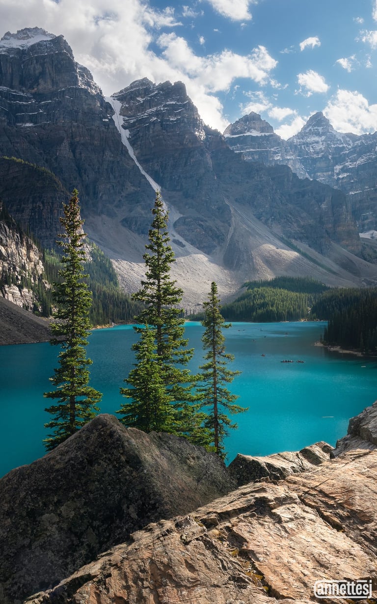
Seeing your image in print is one of the most rewarding aspects of photography. There is nothing like seeing this moment you captured reproduced accurately on large scale. It was extremely gratifying to print out this image of Moraine Lake on a big, 16x24" metal print with accurate color and detail. It is currently on display at the Kent Summer Art Exhibit, and received a purchase award from the Kent Arts Commission.
Proofing can also be done in Photoshop, and sometimes must be; not all ICC profiles are compatible with Lightroom. This will be a blog topic for another time!
I hope you enjoyed this beginner's guide to printed, and perhaps it inspired you to give it a try.


Contacts
annette@annettesjphoto.com
Socials
Copyright © 2023-2025 Annette Stiers Jones Photography. All rights reserved.